-
Architects: Robert Majkut Design
- Area: 483 m²
- Year: 2011
-
Photographs:Szymon Polański

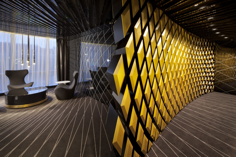
Text description provided by the architects. The starting point for this project was Bank’s corporate identity developed by White Cat Studio, above all the modernized logo of PKO Bank Polski in its elegant color version for Private Banking sector - black, white and gold, which created a set of basic colors for the interior. Other graphical elements were also inspiring – in particular one decorative motif consisting of a grid of elegant, sinusoidal lines, consistently applied in the graphic design for the PKO Bank Polski Private Banking.

The theme of delicate grid was treated in a very innovative way – a bi-dimensional pattern was completely transformed by introducing an additional dimension: it was made spatial by being projected on the tri-dimensional model of the interior. To achieve this effect special software for parametric design was used, which allowed for the creation of a complex and ordered structure formed as a transformation of the subtle grid of lines converging in one abstract point. This complicated geometry setting has become a model to be filled with interior design solutions.

As a composition it is coherent and complete, being a real challenge at the stage of realization. The final effect is a balance between purely aesthetic choices and a mathematical order, accepted by the designer, yet generated by software that was treated not only as a tool, but as a creative factor. It is a kind of metaphorical code which presents the character of the institution and its services, being a mix of mathematical analyses and human element of experience, knowledge, and decision making process.

Corporate colors of PKO Bank Polski - black, white and gold - have been applied with full consequence, further complemented by shades of gray. The designer has taken an specific way to play with the tones of gold which are set in the interior in a kind of drama. Gold balances strong, graphic contrast between black and white and has unique decorative qualities and rich symbolism – as a warm and noble color referring to such values as prestige, stability and prosperity.

The branch is clearly divided into two functional areas – of customer service and the back-office. In those two separate zones, the design solutions are aimed at effectively matching various spaces with their specific functions.


